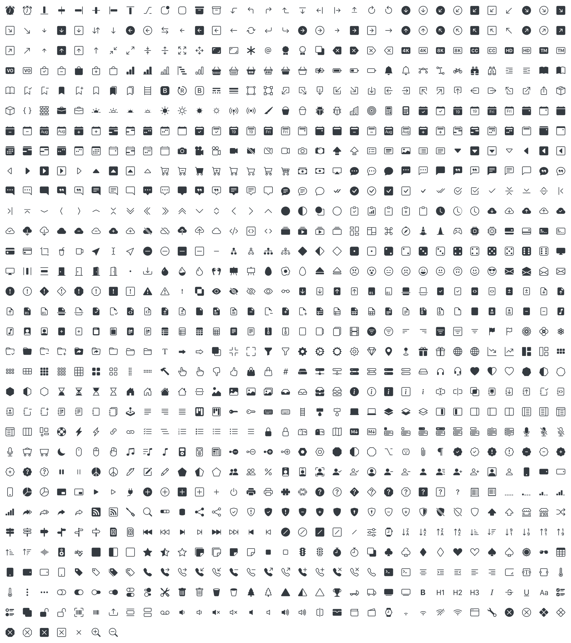
Bootstrap 開源了首套 SVG 圖示庫 Bootstrap Icons,其團隊表示這是有史以來第一次擁有自己的圖示庫,此圖示庫起初專門針對其元件(從表單控制元件到導航)和文件進行定製設計和構建,現在可以免費用於任何專案,無論此專案是否使用了 Bootstrap。
檢視 Bootstrap Icons »https://icons.getbootstrap.com/
既然 Bootstrap Icons 是 SVG 圖示庫,因此它們可以快速、輕鬆地擴充套件,並且可以配合 CSS 的使用進行個性化定製。雖然它們是為 Bootstrap 設計的,但可以在任何專案中使用。不過要注意的是,它們現在尚處於 alpha 階段,未來可能會出現重大變化。
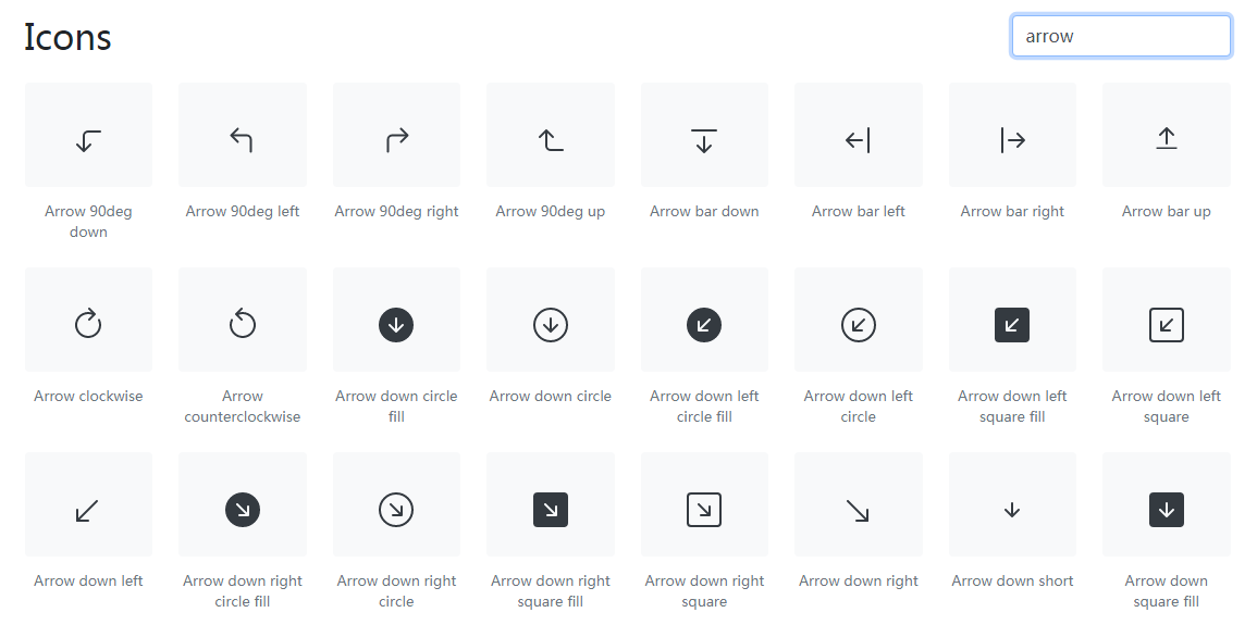
Bootstrap Icons 官網提供了檢索圖示種類的搜尋框,使用者可根據需求使用關鍵字(英文)進行查詢。
根據自己的設定,可以透過多種方式將 Bootstrap Icons 新增到專案:
<svg class="bi bi-chevron-right" width="32" height="32" viewBox="0 0 20 20" fill="currentColor" xmlns="http://www.w3.org/2000/svg"><path fill-rule="evenodd" d="M6.646 3.646a.5.5 0 01.708 0l6 6a.5.5 0 010 .708l-6 6a.5.5 0 01-.708-.708L12.293 10 6.646 4.354a.5.5 0 010-.708z"/></svg>
<img>元素引用
<img src="/assets/img/bootstrap.svg" alt="" width="32" height="32" title="Bootstrap">
<svg class="bi" width="32" height="32" fill="currentColor">
<use xlink:href="bootstrap-icons.svg#heart-fill"/>
</svg>
<svg class="bi" width="32" height="32" fill="currentColor">
<use xlink:href="bootstrap-icons.svg#toggles"/>
</svg>
<svg class="bi" width="32" height="32" fill="currentColor">
<use xlink:href="bootstrap-icons.svg#shop"/>
</svg>
.bi::before {
display: inline-block;
content: "";
background-image: url("data:image/svg+xml,<svg viewBox='0 0 16 16' fill='%23333' xmlns='http://www.w3.org/2000/svg'><path fill-rule='evenodd' d='M8 9.5a1.5 1.5 0 1 0 0-3 1.5 1.5 0 0 0 0 3z' clip-rule='evenodd'/></svg>");
background-repeat: no-repeat;
background-size: 1rem 1rem;
}
[admin
]
來源:OsChina
連結:https://www.oschina.net/news/117616/open-source-svg-icon-library-for-bootstrap
Bootstrap 開源 SVG 圖示庫 Bootstrap Icons已經有311次圍觀
