本文實例為大家分享了Android自定義帶動畫效果的圓形ProgressBar,供大家參考,具體內容如下
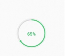
最近有個需求顯示進度,尾部還要有一標示,像下邊這樣
使用自定義View的方式實現,代碼如下,很簡單註釋的很清楚
文章最後我們拓展一下功能,實現一個帶動畫效果的進度條
package com.example.fwc.allexample.progressbar; import android.animation.ValueAnimator; import android.annotation.TargetApi; import android.content.Context; import android.content.res.TypedArray; import android.graphics.Canvas; import android.graphics.Color; import android.graphics.Paint; import android.graphics.RectF; import android.graphics.Typeface; import android.os.Handler; import android.os.Message; import android.text.TextUtils; import android.util.AttributeSet; import android.util.Log; import android.view.View; import android.view.animation.DecelerateInterpolator; import com.example.fwc.allexample.R; /** * Created by fwc on 2016/7/6. */ public class CircleProgressBar extends View { private Context mContext; private Paint mPaint; private int mProgress = 0; private static int MAX_PROGRESS = 100; /** * 弧度 */ private int mAngle; /** * 中間的文字 */ private String mText; /** * 外圓顏色 */ private int outRoundColor; /** * 內圓的顏色 */ private int inRoundColor; /** * 線的寬度 */ private int roundWidth; private int style; /** * 字體顏色 */ private int textColor; /** * 字體大小 */ private float textSize; /** * 字體是否加粗 */ private boolean isBold; /** * 進度條顏色 */ private int progressBarColor; public CircleProgressBar(Context context) { this(context, null); } public CircleProgressBar(Context context, AttributeSet attrs) { this(context, attrs, 0); } public CircleProgressBar(Context context, AttributeSet attrs, int defStyleAttr) { super(context, attrs, defStyleAttr); mCOntext= context; init(attrs); } @TargetApi(21) public CircleProgressBar(Context context, AttributeSet attrs, int defStyleAttr, int defStyleRes) { super(context, attrs, defStyleAttr, defStyleRes); mCOntext= context; init(attrs); } /** * 解析自定義屬性 * * @param attrs */ public void init(AttributeSet attrs) { mPaint = new Paint(); TypedArray typedArray = mContext.obtainStyledAttributes(attrs, R.styleable.CircleProgressBar); outRoundColor = typedArray.getColor(R.styleable.CircleProgressBar_outCircleColor, getResources().getColor(R.color.colorPrimary)); inRoundColor = typedArray.getColor(R.styleable.CircleProgressBar_inCircleColor, getResources().getColor(R.color.colorPrimaryDark)); progressBarColor = typedArray.getColor(R.styleable.CircleProgressBar_progressColor, getResources().getColor(R.color.colorAccent)); isBold = typedArray.getBoolean(R.styleable.CircleProgressBar_textBold, false); textColor = typedArray.getColor(R.styleable.CircleProgressBar_textColor, Color.BLACK); roundWidth = typedArray.getDimensionPixelOffset(R.styleable.CircleProgressBar_lineWidth, 20); typedArray.recycle(); } @Override protected void onDraw(Canvas canvas) { /** * 畫外圓 */ super.onDraw(canvas); int center = getWidth() / 2; //圓心 int radius = (center - roundWidth / 2); //半徑 mPaint.setColor(outRoundColor); //外圓顏色 mPaint.setStrokeWidth(roundWidth); //線的寬度 mPaint.setStyle(Paint.Style.STROKE); //空心圓 mPaint.setAntiAlias(true); //消除鋸齒 canvas.drawCircle(center, center, radius, mPaint); //內圓 mPaint.setColor(inRoundColor); radius = radius - roundWidth; canvas.drawCircle(center, center, radius, mPaint); //畫進度是一個弧線 mPaint.setColor(progressBarColor); RectF rectF = new RectF(center - radius, center - radius, center + radius, center + radius);//圓弧範圍的外接矩形 canvas.drawArc(rectF, -90, mAngle, false, mPaint); canvas.save(); //平移畫布之前保存之前畫的 //畫進度終點的小球,旋轉畫布的方式實現 mPaint.setStyle(Paint.Style.FILL); //將畫布座標原點移動至圓心 canvas.translate(center, center); //旋轉和進度相同的角度,因為進度是從-90度開始的所以-90度 canvas.rotate(mAngle - 90); //同理從圓心出發直接將原點平移至要畫小球的位置 canvas.translate(radius, 0); canvas.drawCircle(0, 0, roundWidth, mPaint); //畫完之後恢復畫布座標 canvas.restore(); //畫文字將座標平移至圓心 canvas.translate(center, center); mPaint.setStrokeWidth(0); mPaint.setColor(textColor); if (isBold) { //字體加粗 mPaint.setTypeface(Typeface.DEFAULT_BOLD); } if (TextUtils.isEmpty(mText)) { mText = mProgress + "%"; } //動態設置文字長為圓半徑,計算字體大小 float textLength = mText.length(); textSize = radius / textLength; mPaint.setTextSize(textSize); //將文字畫到中間 float textWidth = mPaint.measureText(mText); canvas.drawText(mText, -textWidth / 2, textSize / 2, mPaint); } public int getmProgress() { return mProgress; } /** * 設置進度 * * @return */ public void setmProgress(int p) { if (p > MAX_PROGRESS) { mProgress = MAX_PROGRESS; mAngle = 360; } else { mProgress = p; mAngle = 360 * p / MAX_PROGRESS; } } public String getmText() { return mText; } /** * 設置文本 * * @param mText */ public void setmText(String mText) { this.mText = mText; } /** * 設置帶動畫的進度 * @param p */ public void setAnimProgress(int p) { if (p > MAX_PROGRESS) { mProgress = MAX_PROGRESS; } else { mProgress = p; } //設置屬性動畫 ValueAnimator valueAnimator = new ValueAnimator().ofInt(0, p); //動畫從快到慢 valueAnimator.setInterpolator(new DecelerateInterpolator()); valueAnimator.setDuration(3000); //監聽值的變化 valueAnimator.addUpdateListener(new ValueAnimator.AnimatorUpdateListener() { @Override public void onAnimationUpdate(ValueAnimator animation) { int currentV = (Integer) animation.getAnimatedValue(); Log.e("fwc", "current" + currentV); mAngle = 360 * currentV / MAX_PROGRESS; mText = currentV + "%"; invalidate(); } }); valueAnimator.start(); } }自定義屬性
佈局文件中使用
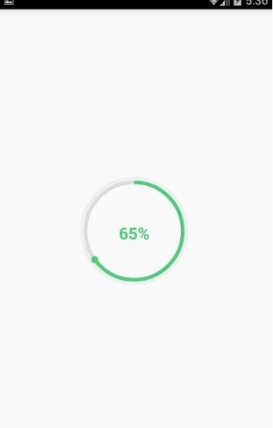
activity中設置進度,顯示文字
package com.example.fwc.allexample.progressbar; import android.support.v7.app.AppCompatActivity; import android.os.Bundle; import com.example.fwc.allexample.R; public class ProgressActivtiy extends AppCompatActivity { CircleProgressBar circleProgressBar; @Override protected void onCreate(Bundle savedInstanceState) { super.onCreate(savedInstanceState); setContentView(R.layout.activity_progress_activtiy); circleProgressBar = (CircleProgressBar)findViewById(R.id.progress_bar); circleProgressBar.setProgress(65); circleProgressBar.setmText(circleProgressBar.getProgress()+"%"); } }效果圖
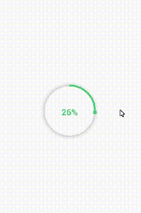
拓展
拓展也很簡單,加一個setAnimProgress(int p)設置動畫效果:
/** * 設置帶動畫的進度 * @param p */ public void setAnimProgress(int p) { if (p > MAX_PROGRESS) { mProgress = MAX_PROGRESS; } else { mProgress = p; } //設置屬性動畫 ValueAnimator valueAnimator = new ValueAnimator().ofInt(0, p); //動畫從快到慢 valueAnimator.setInterpolator(new DecelerateInterpolator()); valueAnimator.setDuration(3000); //監聽值的變化 valueAnimator.addUpdateListener(new ValueAnimator.AnimatorUpdateListener() { @Override public void onAnimationUpdate(ValueAnimator animation) { int currentV = (Integer) animation.getAnimatedValue(); Log.e("fwc", "current" + currentV); mAngle = 360 * currentV / MAX_PROGRESS; mText = currentV + "%"; invalidate(); } }); valueAnimator.start(); }在activity中調用這個方法
circleProgressBar.setAnimProgress(65);
效果如下
[techdo ] Android自定義帶動畫效果的圓形ProgressBar已經有296次圍觀
